Designer – Katarina Zelenika Role – Design & Direction Project – Packaging concept

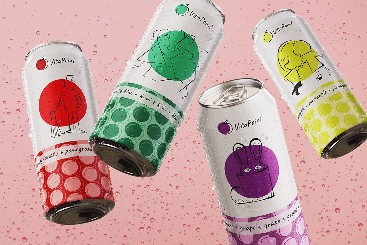
The project included brand identity, logo, illustrations and package design. The goal was to create a minimal, modern and playful feel for these unusual flavors. I used the colors that correspond to the fruit each juice is made out of: green for kiwi, red for pomegranate, yellow for pineapple and purple for grape. Using color like that allows the illustration to stand on it’s own without clashing with the product. It’s only role in this case is to grab the attention of the viewer which leaves a lot of room for creativity. The weirder the illustration the better!
We associate busy, bright and loud designs with sugar and unhealthy additives because those usually cater to kids. By using the minimalist approach of putting colors on a simple white background we don’t only make the design pop but also make the customer feel the exact opposite. The brain makes the connection that the product is natural and good for you.


The logo follows the same designing rules as the rest of the branding. I used a handwritten font style to make the brand feel casual, like something you can just grab on your way anywhere you go. It mimics the line art from the illustrations and keeps the possibility for adapting to any new flavors in the future by simply changing the color of the circle!


Thanks for viewing! Let me know want you think in the comments below!


